
One of my current projects is a box (designed to go on a bookshelf), the side of which looks like book spines. I thought it would look good if I could print text on the ‘spines’, for the fake book titles. So I searched YouTube for ideas about how to print on wood. It turns out there are various ways of doing this. The simplest way entails printing onto the waxy paper that you get on the back of labels, and then rubbing the ink off onto the wood, following these steps:
- Create what you want to print on your computer
- Reverse the image on your computer
- Get some printer labels and peel off the labels and discard them, keeping the waxy backing paper
- Put the waxy paper in your printer such that it will print on the shiny (waxy) side
- Print the image – the ink will not dry on the non-porous paper.
- Put the paper onto your piece of wood, ink-side down, and rub the back of the paper with your finger tips to transfer the ink to the wood
Sounds easy doesn’t it! Yeah, well, as usual things are never as simple as they seem.

I followed the above steps using my printer’s default settings. As soon as I saw what had been printed, I knew something was not optimal! (Initial tests were done by transferring to paper, not wood) – this is what I got:

Not good! I remembered that I read in a YouTube comment that you can avoid ink blobs by printing using the ‘draft’ setting in the printer setup, so that’s what I tried next:

Aha! That was much more even but a bit faint. In the printer setup, I left it on draft but darkened the print:

That was better still but not as dark and solid as I’d hoped for. I read more comments and someone suggested high quality printing makes the printer go slower. So I set my printer settings to Glossy Photo Paper:

Aha! That was much better. I set it to print darker:

Slightly better still. Finally I set my printer to the highest quality photo paper available (Glossy Platinum, or something), set it to the finest print quality, set it to as dark as it would go and increased the contrast:

Ignore the slight error where the paper moved as I transferred the image. The black was now nice and dark with solid and even coverage. Now it was time to try the same test on some wood (Maple):

I was very pleased with the result – just a slight amount of bleeding. I decided to go against perceived wisdom and tried to paint over the logo with acrylic varnish using a brush:

It turns out that perceived wisdom is correct! It completely smeared the ink.
So I printed another logo and this time sprayed it with acrylic lacquer:

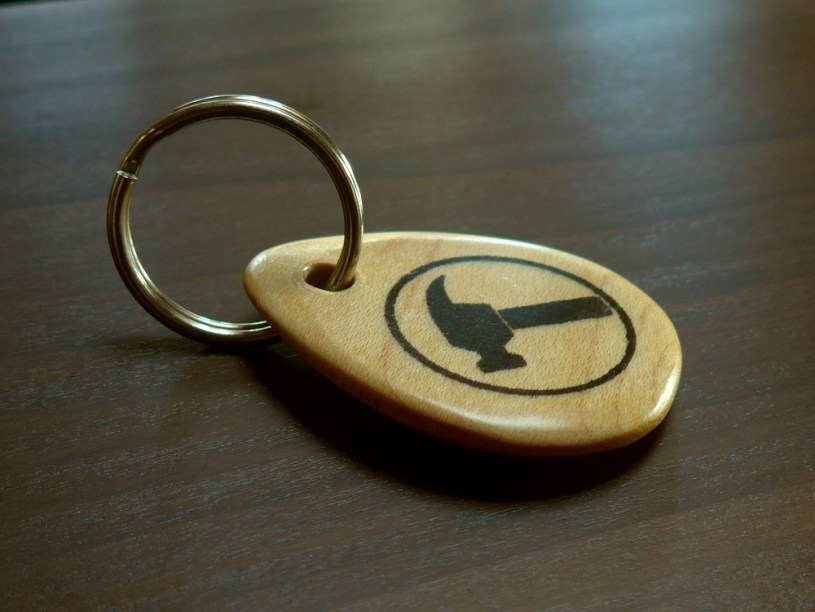
That was good! Now it was time to try it on a small project. I printed out just the logo.

After spraying it with acrylic lacquer to protect the logo, I used the bandsaw to cut a thinner slice of the wood


I sketched the shape of a key fob with permanent marker and roughly cut the waste away on the bandsaw

.. then used the disc sander to smooth the shape

.. then used the belt sander to round over the edges


.. and used some fine silicon carbide abrasive paper to remove the sanding marks

Then I sprayed the whole thing with acrylic lacquer

It looked like a huge plectrum….
until I drilled a hole in it, and stuck a key ring through the hole


I finally applied wax using 0000 wire wool, to soften the sheen and improve the feel (and smell!).
Gallery
Click an image to enlarge it and scroll through other images.


Tools used
- Canon Pixma MG5700 printer (using compatible ink)
- Bandsaw
- Mirka hand sanding block
- 9″ disc sander
- 6″ belt sander
- Wood/felt sanding block
- Cordless drill
- Permanent marker
- Automatic centre punch
Materials used
- American Hard Maple
- 1 x key ring
- 180-grit Abranet abrasive sheet
- 380-grit Silicon carbide paper
- AutoTek clear acrylic lacquer spray
- A4 paper (for tests)
- Printer labels (for backing sheet) – Avery L7163
- Liberon Black Bison paste wax, clear
- Rustins 0000 wire wool
Things that worked well
- After experimentation, the technique works very well and is cheap, quick and simple.
- I used 14-labels-per-sheet printer labels and peeled off only the label for the area I was printing to. I used an Excel template to position the design on the correct label space. This allowed the sheet to feed through the printer better and I could keep the unused part of the sheet covered until I needed to use it.
Things that didn’t work (and improvements)
- Although I sanded the maple before transferring the print, there was some slight bleeding of the ink along the grain. Things might be improved if it was sanded to a very fine grit (1000) or maybe even burnished somehow.
- The hole for the ring was slightly too big.
- As I was making this I realised that the key fob would be stronger had I orientated the grain along the length of the piece instead of across. Where the hole is has short grain so is a potential weak spot.
- When spraying the acrylic lacquer I turned the piece over once one side felt dry to the touch so I could spray the other side. But the downwards side wasn’t quite dry, it seems, because it stuck to the surface underneath! Damn. I had to sand back and start again (twice!)
